Monday, 21 April 2014

Marino Marini, horse artist


Marini  Rider 1953 tempera on paper 26.2 x 34.3 cm

Marini  Equestrian composition  1954 Oil on canvas 51 x 43 cm


Since completing the preparation for the Glasgow exhibition, I have been looking at the drawings, paintings and sculpture of Marino Marini (1901-1980), who was a tremendous horse artist, as well as portrait artist.  He worked in an expressionist  way, going far beyond the directly figurative Western tradition of equestrian art, and he was evidently inspired by the forms of the Chinese horse sculptors, as well as primitve artists from Etruscan period. 

Marini  Rider 1950 Oil on canvas  78.5 x 57 cm

Marini  Horse 1945 Bronze 45 x 51 cm

Marini  Horse 1946  Bronze  44 x 19.5 x 51.5
 

Wednesday, 16 April 2014

"The Horse in Mind" Glasgow Art Club exhibition May 2014

I have been working on an exhibition at the prestigious Glasgow Art Club, in the centre of Glasgow. This beautiful building has been the home of GAC since 1893, so it is full of atmosphere and  memories of past artists from this great city and beyond.  It is located a stone's throw from the equally prestigious Glasgow School of Art.

 
Tang 2  charcoal on paper   590 x 610

I was asked to make equestrian drawings for this event, and it has been a great opportunity to "binge"on horse drawing day after day in the studio. 

Fragment 2   charcoal on paper 600 x 400

Some of the drawings are studies from history.  I am fascinated by the knowledge and passion shown by equestrian artists of ancient civilizations.  There is something very evocative about the fragments seen in museums, simply because they ARE ghostly traces of once-powerful cultures.  But they are often wonderful works of art as well.  For example the Parthenon frieze, which celebrates the cavalry of the Athenians, is full of life and energy and human and equestrian expression, as well as being superb quality sculpture which shows an intimate knowledge and study of horses and men and drapery.

Parthenon pair   acrylic on ply  38 x 15

Beyond this, it is compelling to look at the ways in which horses have been portrayed.  The Greeks modelled the horse very realistically, emphasizing its sculptural anatomy and its exuberance.  The Chinese Tang ceramic sculptors greatly exaggerate the body of the horse, giving it a statuesque quality, but also a very strong and dynamic one.  I love to try and get inside the mind of these artists, and it excites me to feel their abstract and formal interpretation of the horse. I would like to work quite abstractly, and not always adhere to the more traditional Western way of painting and drawing horses.  That is a challenge which I have to take as it comes, in its own time.

Startled horse   Charcoal and acrylic paint on cotton  920 x 770

For the exhibition I have also been doing some more intimate and realistic portrayals, mostly working from imagination or translating some of my studies into more dynamic form.  Often a conscious study, as in the case of my charcoal "Tang" drawings will emerge in a different and unexpected form.  It has been a fascinating journey so far, and of course one that I shall continue long after this exhibition. 

The exhibition runs from 12th May to 5th June, 2014, 
Monday to Saturday   11 am to 5 pm  
The Glasgow Art Club, 
185, Bath Street
Glasgow G2 4HU
0141 248 5210 

Friday, 14 March 2014

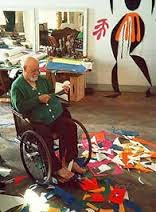
Matisse "The audacity of simplicity"


"Do I believe in God?  Yes, when I work"  (Matisse)


Wednesday, 12 March 2014

Why is painting so complicated?


Diana Hand Red and pink 30 x 15  Acrylic on board

Diana Hand Arctic   30 x 15  Acrylic on board

 
I have never felt confident about making paintings. A lot of people seem to share this vulnerability., as though they  are putting their self confessed "inadequacy" on public display.  But it is not like this with drawings.  That we can do without self consciousness or fear of failure or ridicule.  But...pick up a paintbrush with the intention of making marks on a surface and suddenly the whole canon of western art is on your shoulder. Plus there are the uncertainties of working with the mysterious properties of paint and its awkward property of colour -a lot of different colours, uncontrollable and unpredictable in their relationships with each other.. 

Diana Hand Special place 18 x 16  acrylic on canvas

So how to find a path?  One way is to learn traditional painting skills and make the kind of figurative work that is still much admired (and bought) today.   Then at least one can hold onto those precious skills and fine tune them.  I never really got on with that way.  Perhaps I did not have the patience, maybe I felt it had been done so many times before and so much better.  But it did seem to be a necessary stage in learning to paint. -  just go into any bookshop or art store for examples.

For me colour is a gestural statement, and for years I have found a satisfying expression of my energy by applying colour in the form of liquid dye to cloth. I sometimes think "that would make a great painting" or "that really works" , but have also thought also that making a painting was an entirely different statement and procedure.  Right, up to a point.  But what if when I did a piece of cloth, I also created  a little painting with acrylic?  Quite thin acrylic, echoing the translucency of the dye.

Diana Hand Colour games 18 x 16 acrylic on canvas

What happens is that I start to think of the "painting" process in a completely different and entirely abstract way.  No more angst about line and tone and complementary or simultaneous colours.  Just let paint works its magic, mixing the natural energy of painting with dye with the improved scope and control of paint on board or canvas.  Watch this space.

I started to try this new approach courtesy of  the late Abigail Mclellan's recent exhibition at Open Eye Gallery.  Abi used acrylic in her own way, building up layers of glazing to create a glowing effect.   My thinking was miraculously reinforced by a visit to the Klee exhibition last week.. "paintings saturated with primary colours liberated from specific local objects, and this independence of colour from form presaged abstraction" (Making Visible Tate catalogue p. 19) 

Diana Hand Special place #2  18 x 16 acrylic on canvas

PS   But the next day I returned to three-dimensional work, grounded in the body, and relating more senses than just the visual.  Relief!   Painting is too scary, full of unknowns with the colour slipping about and presenting a million variables and opening up holes in the consciousness in a sneaky way.  It is too uncertain for me. It just takes huge amounts of psychic energy.
 

Sunday, 9 March 2014

Paul Klee "Making Visible" exhibition at Tate Modern, London


Paul Klee in 1911


“First of all, the art of living; then as my ideal profession, poetry and philosophy, and as my real profession, plastic arts; in the last resort, for lack of income, illustrations.”

—Paul Klee.


I visited the Paul Klee exhibition at Tate Modern in London this week. Klee (1879-1940) had always seemed a mythical figure to me, inaccessible and remote in his iconic status and his enigmatic paintings and writings.  I approached with trepidation. This was going to be hard work, I thought, and time to put the “effort” cap on.  It turned out in fact to be a most rewarding experience.  This is a large exhibition, and it was organised sequentially, with particular emphasis on Klee’s constant experiments with different techniques.


This meant that it was possible to see the full range of his work, from the most detailed early fine drawings to the extremely vague spray paintings, via delicate abstract watercolours, and this helped me to understand and admire him as someone who bravely experimented throughout his life, had his frustrations and (ultimately) great successes, and it was an opportunity to see all his work as a unity.  I also understood him as someone more accessible that I could learn from. 

View of Kairouan (1914)  watercolour

My holiday photo of Kairouan medina (2012)

The personal and historical aspects of Klee’s life were well described:  for example, the significance of his friendship with Macke, Marc and Kandinsky (some other members of the Blaue Reiter group).  Only when he met artists such as this was he able to clarify and develop his ideas more fully.  A brief trip to Tunis with these friends in 1913 was, famously, very important to him. For the first time as an artist he felt confident about using colour, particularly in an abstract way.  Colour and I are one” he wrote “Colour possesses me.  I don’t have to pursue it.  It will possess me always; I know it”.  For Klee, colours had their own spiritual, emotional and symbolic properties which are distinct from colours found in “reality”.


Battle scene from the Comic-Fantastic opera "The Seafarer" (1923)


Many artists of Klee’s generation were rethinking art in the contemporary industrial world, and also in the light of a new awareness of the subconscious.  Nowadays we are rethinking art in the new digital world, but in contrast I don’t think we are so concerned with the subconscious, rather more we are exploring the mysteries of the mind and body as a form of neuroscience.  For Klee art was always a balance between the rational and the intuition, and the successful resolution of that tension is one thing that makes his work so strong.  It is a theme that runs through all his work, and unites the different “styles” of his paintings.

Ghost of a genius (1922)  Oil transfer drawing and watercolour

Crosses and columns (1931) pointillist method
 The styles reflect his constant experimentation with techniques. These range from extremely precise drawing to the vaguest cloud paintings.  He is celebrated for his “gradations”, in which he builds up layers of overlapping colour, either in watercolour or oil paint.  Another favourite way of working was to reproduce the spontaneity of the quick sketch (statement from the subconscious?) by monoprinting it onto a clean sheet of paper which could then be worked in other media to build up the colour.  Later he experimented with spray paint and pointillisme, and with different surfaces such as raw burlap.


Fire at Full Moon (1933)

I was also very impressed with the extreme meticulousness with which he approached his art, particularly when working out a system of teaching, and in cataloguing and numbering every single drawing and painting, so he had a quick overview of all his work.  How much simpler life would have been for him in the digital age.


The visit was a most positive and inspiring experience for me.


Saturday, 8 March 2014

Roy Oxlade obiturary

Olympia's Trolley (1989)  by Roy Oxlade

I enjoy the way this painting relates to my previous post about Chanel catwalk show.!

Roy Oxlade was a celebrated painter and an excellent and dedicated teacher, as well as being an opponent of self conscious "artiness" :)).  Read more about his life here

Friday, 7 March 2014

Chanel Paris show staged in designer supermarket!


A model shopping in the Chanel grocery store aka Paris catwalk

A model sets down her Chanel chainsaw to look at groceries


"Last season Lagerfeld riffed on fashion and art, but this season's supermarket sweep collection suggested he believes commerce and desire are equally as valid and not something to be ashamed of."  (Imogen Fox)


I like this sentiment, up to a point.  Trouble is, commerce and desire tend to find their way to the top of the pile rather more easily than art!

To see more go to Chanel supermarket sweep